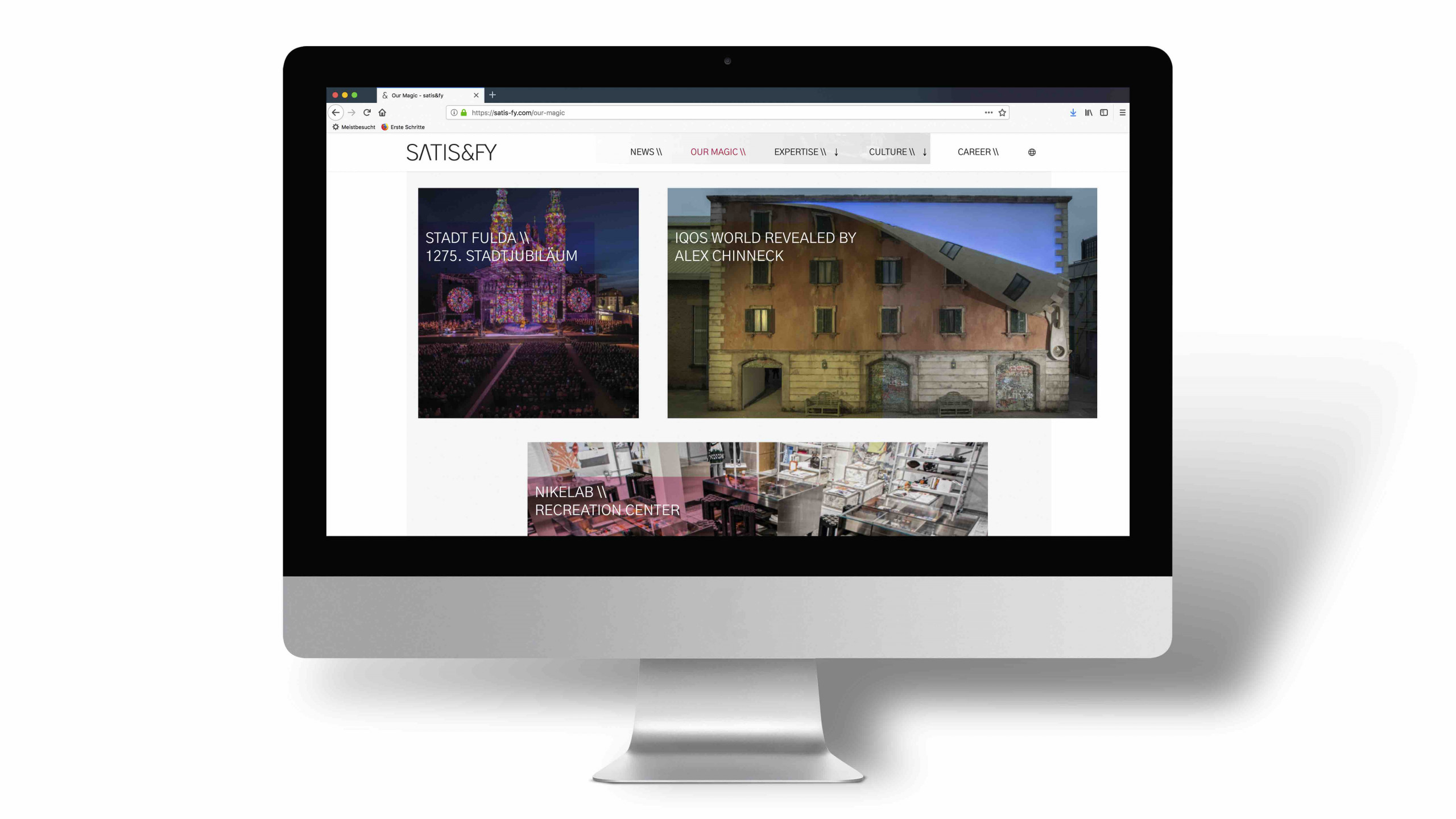
satis&fy is live with a new, global website. The improved homepage is the new digital flagship and the brand communication anchor of the international player for live communication and 3D marketing. The goal: an improved customer approach and user experience. The new page offers an upgraded page structure, revised content, a clear design and intuitive navigation. The visual alignment is based on the new brand design that was presented at the beginning of the year.
The design of our new internet presence not only benefits the user experience, but according to Martin Jerulank, satis&fy Digital Project Manager, also underlines the new brand promise: „We are trusted with bringing the most ambitious ideas to life. Worldwide“. When referencing the company: “Our customers should see at first glance that we are the right partner for them when it comes to developing outstanding solutions for new customer experiences and initiating innovative, creative ideas, whether in live communication, trade fairs or shop fittings.” The focus for the website relaunch was based on an attractive functional design, intuitive user guidance and a simple structure of content. “Our old website no longer met the usage requirements of our visitors. Our goal was therefore to create a user-friendly, easily understandable and informative site that people would enjoy to access,” explains Jerulank.
The new start page now offers an overview of all current topics and enables easy contact with the company. Special projects are prominently displayed there via a feature box. The menu item “Our Magic” in the navigation bar provides useful insight on projects with which, according to Jerulank, “above all, the customer would like to be inspired by.” The “Expertise” section shows where the company’s strengths and core competencies lie. Satis&fy also offers something new in terms of content under the “Culture” menu item. There you will find a lot of information about the corporate culture, including the guidelines and personal stories of satis&fy employees. It is also gratifying that the website is now available in three languages. „With branches in Germany, The Netherlands and the USA, this step was long overdue.“
In addition to the revision of the content, the new website also displays a fresh and contemporary appearance. The visual realignment was based on a clear and transparent design to convey structure and simplicity. Large images, soft contrasts, clear lines and a lot of white space dominate to convey calm and clarity. When it comes to the typeface, meaningful headings, subheadings and short text blocks were used to make it easier to read. During the technical implementation, the focus was on faster loading times. Responsive design also makes navigation user-friendly on all mobile devices. New feature: visitors can now also subscribe to a newsletter.
Aiming to continue to fill the page with life, further changes and measures are planned. “Latest by the end of the year, we would like to integrate our web shop for used event technology, which is currently possible via an external landing page, on the site. We’re also working on incorporating more video content,” says Jerulank. New stories will also be added to the culture stories. A search function will also be retrofitted.


